Building This Site, Again
In October this site got a new look. Same sections, same posts, new everything else.
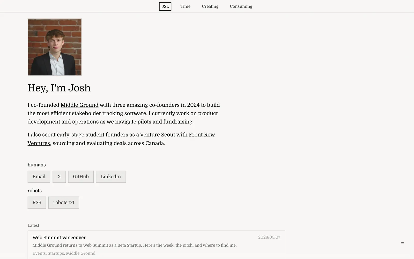
In January I wrote Building This Site about the first version. A lot of what that post shows has gone: the Domine type, the blur layer over the background and the borders that drew themselves on hover. The progress bar it mentions is now the Contents list in the margin of this page, if your screen is wide enough to show it.
The new version is an editorial broadsheet. The site is a printed sheet: paper and ink, ruled into columns like a newspaper, with numbered sections and a dateline in the nav that gives the time in Vancouver. I built it with Claude Code again, this time over one long evening.
Colour
Before, the site was pure black on an off white, #000000 on #fbf8f4. Now there are three colours.
Paper is a shade warmer and darker than the old off white, and ink is a brown black rather than pure black. Together they look printed rather than lit.
Ink does nearly all the work. It is full strength for text, about half for labels, and 18% for every rule on the page.
The orange is the one loud thing, so it only marks what is live: the number of the page you are on, section numbers, link underlines, arrows as you hover them, the square under your cursor, the line in the Contents margin as you read and the scrollbar thumb while you drag it. Select some text and it turns a pale orange too.
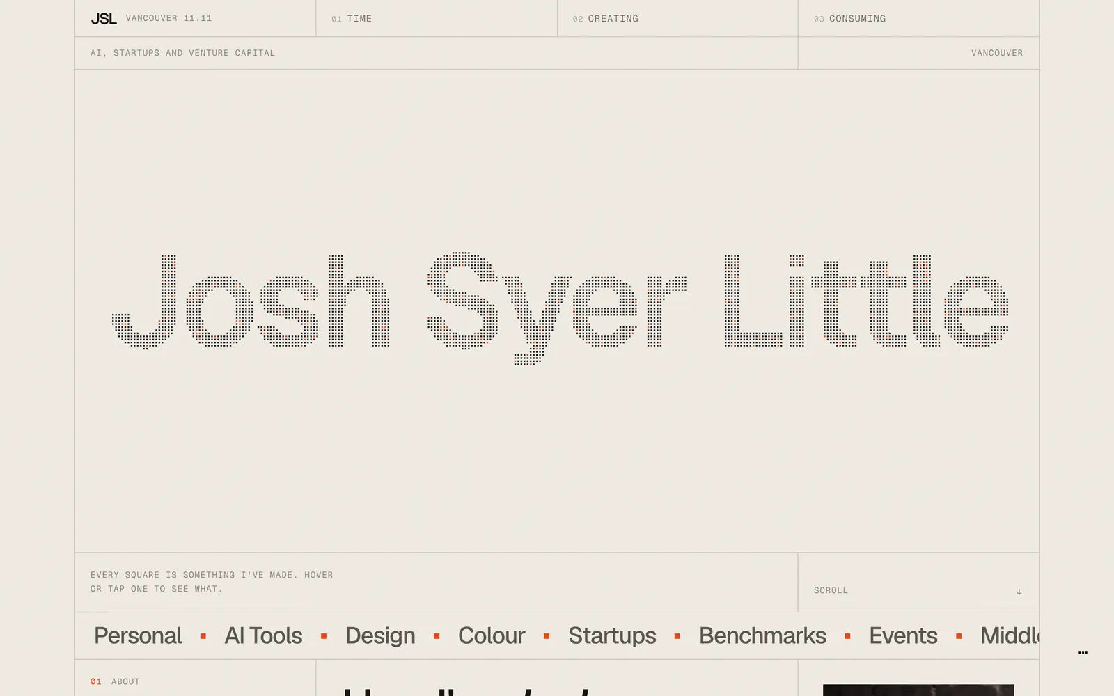
It shows up at rest in two places, on purpose. About six in every hundred squares of my name are orange, picked at random, and my photo on the home page sits in grey under an orange wash until you hover it. Over all of it sits a film grain at 15%.
Type
The first take set its headlines in Instrument Serif. It didn't go well with the icons or the layout, so everything moved to Geist and Geist Mono. The arrows, carets and ticks had been typed characters the fonts didn't include, so they fell back to system fonts. Now they are drawn as SVG, with square ends to match.
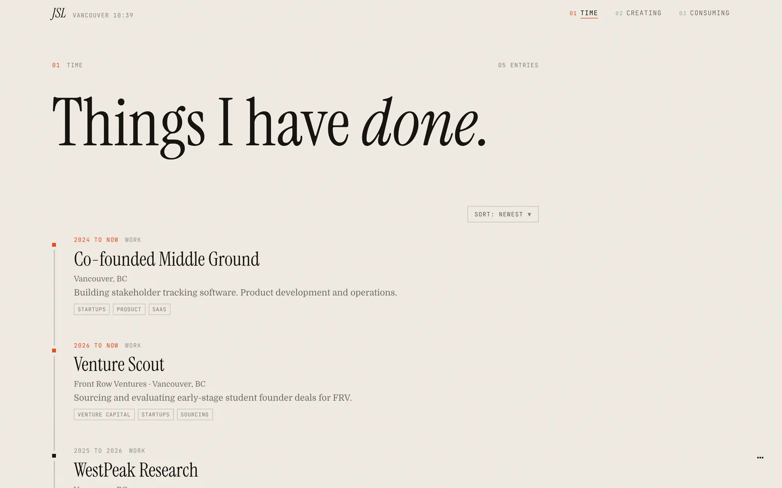
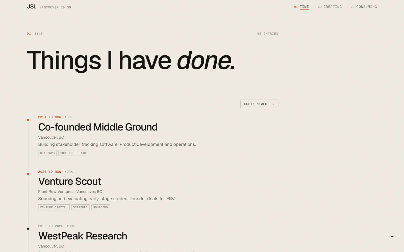
Headlines are Geist at weight 500, set tight. Labels, dates and the nav are Geist Mono, most of them at 11 pixels in spaced capitals. Each section's masthead ends on one italic word: “Things I have done.”, “Notes from the workbench.” and “What goes in.”
Grid
Every page is now one sheet of ruled cells, twelve columns wide from tablet size up with a rule at every quarter, and two halves on a phone. The nav is the first row, and its column rules run down through everything below it, this post included. The rules are hairlines, 0.3 pixels of ink at 18%, so they read as ruled paper rather than boxes.
The old site hid its scrollbar. With a mouse or a trackpad it is now one more cell: an 11 pixel gutter ruled off with a hairline, holding a square thumb. The reading progress bar on posts became the Contents list in the margin, which fills in orange as you read.
A grid this strict shows every mistake. The morning after the new site went live, I spotted a rule one pixel out of line.
A few rows, the nav links among them, were dividing up their own width instead of sitting on the page's columns, so their rules landed a pixel off. They sit on the page's tracks now, and every vertical rule on every kind of page was measured at five screen widths to be sure. Sections also used to slide in as you scrolled, which carried their rules off line until they settled. Now the cells hold still and only their contents wipe in, one cell after another.
Squares
The old home page opened with “Hey, I'm Josh”. The new one opens with my name drawn in about 3,200 squares, and every square is a link to something I've made. Each post gets an equal share of them, dealt out at random, and hovering a square opens a small card.
I wanted the squares to react to the cursor without scattering. They work like a light lens: the squares near the pointer spread apart a little, keep their order and spring back.
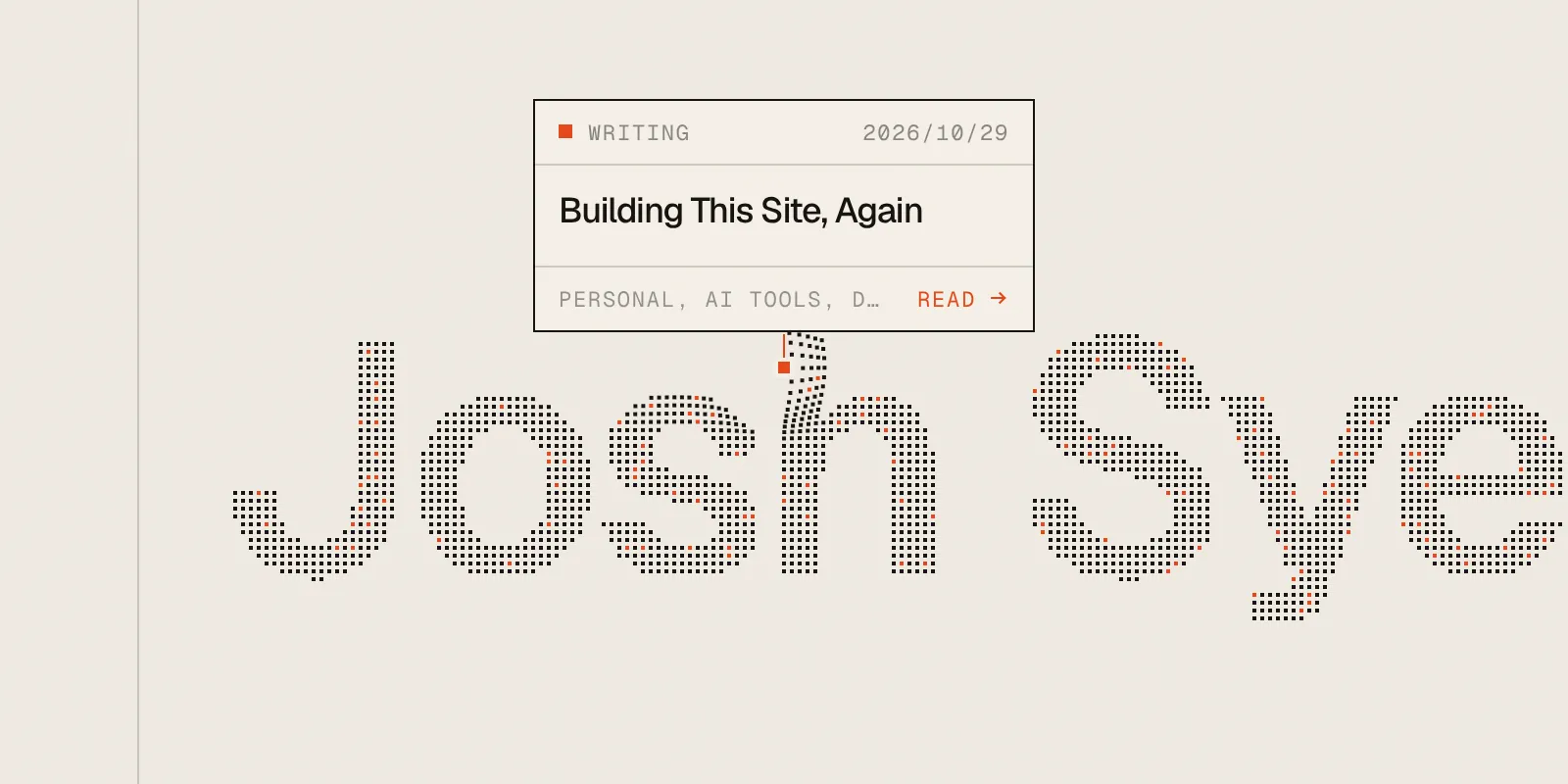
The square is the unit everywhere else too: the scrollbar thumb, the markers on the timeline, the little orange blocks between tags on the home page and the end of every icon stroke. Even the background is squares now. I wanted it pixelated instead of flowy, so it is the same shader as the old site, in paper and grey, cut into squares of 16 pixels and kept faint.
Launch
Every redesign needs a launch video, so this one got one, mostly as a joke. It plays like a keynote that takes itself far too seriously. My photo gets a spec sheet, then a hand drags it down to 72%, because that is “Less intimidating.”
One scene puts my orange next to the oranges of Y Combinator, CodeRabbit, Corgi and Melius and calls it “A completely original orange.” The next morning I made Orange Bench to check. Mine is closest to Product Hunt's.
Before and After
- Colours
- Before: Black on off white
- After: Paper, ink and one orange
- Type
- Before: Domine
- After: Geist and Geist Mono
- Layout
- Before: A single column
- After: Twelve ruled columns
- Lines
- Before: Borders drawn on hover
- After: Hairlines of ink at 18%
- Background
- Before: A flowing shader under a blur
- After: The same shader in squares of 16 pixels
- Scrollbar
- Before: Hidden
- After: Ruled, with a square thumb
- Reading progress
- Before: A progress bar
- After: A Contents list in the margin
- Home page
- Before: Hey, I'm Josh
- After: My name in about 3,200 squares, each one a link
Every square of my name on the home page links to something I've made, so about a tenth of them now link here.